
Business Cards 101
Wednesday, March 4th, 2015 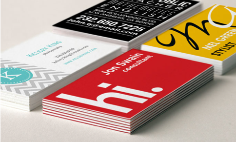
3/4/15
Bad business cards are a pet peeve of mine.
When you go to a networking event or other occasion where you will meet people who will be of interest or benefit to your business, you will of course be exchanging business cards (yes – do NOT forget to have business cards with you at all times!).
But – you want to make sure that your business card has the necessary impact – and accomplishes everything you need. Your business card is a mini-presentation of you and your business. Make sure it is easy for people understand who you are, what your business is and how to contact you.
Here are some important tips:
1. Stock: Cards must be printed on quality, substantial matte finish card stock unless you are using a specialty paper. Flimsy card stock feels cheap.
2. Information: Your card needs to have the following information (as a minimum):
Your name
Your business name
Your contact information including office address, telephone number(s), website, Facebook & Twitter info (note – if you work from home, you may not want to include your address information)
Now, of course, any basic business card has that information. But what can you do to make yours stand out?
3. Logo: If it is appropriate for your business, make sure it has a well-designed graphic logo or a great-looking typographic logo made from your business name. Make sure that logo is PROMINENTLY featured on your card. This seems sort of obvious, but you’d be surprised how many people either don’t have a logo, or don’t position or feature it properly on cards and other materials.
A note about logo design and typography:
When you design or have a logo designed for your company that incorporates words (the name of the company or other words) MAKE VERY SURE that the words are legible (have at least 3 people look at it to make sure they know what it says; a good idea is to print your logo in the sizes you would normally see on a card, on a letterhead and on a web page. Make sure that the font (type style) you use is legible – give it the same test. Again, this may seem obvious, but haven’t you ever been unable to decipher a logo or business name?
4. Your own name – most cards don’t have the name displayed prominently enough or in a large enough point size. That doesn’t make sense. When you connect with people at an event or meeting, they are connecting with YOU as much as your business; make sure that YOU are what they remember.
5. Card color – make sure that the color of the card or the design of the background is not so dark or so busy that the words are illegible. Many networking events take place in ill-lit rooms, and there is no point to having a card if no one can read it. Keep it simple!
For me, this is one of the most important things:
6. KEEP THE BACK BLANK and make sure it has a MATTE SURFACE. When I go to an event and collect a bunch of cards, the first thing I do is write any pertinent information on the back – the date I met the person or the name of the event (if relevant); what we talked about or what the next step is, i.e.: Small Business Meet Up 2/23/15 – send client list/set up coffee/call Monday re: meeting, etc.
Many people have business cards that are printed on a glossy card stock. This looks pretty and can have a nice visual impact, but – you can’t write on the back. Or, many people have a solid color printed on the back side; this can be a terrific-looking design element, but if the color is black or navy blue, again, you can’t write on the back.
7. Size: 99% of the time, it is important to have cards that are a standard size, or close. If cards are too big to fit into a card case or are an unusual shape, oftentimes they will be thrown away. If a card is too small, it can get lost.
Exceptions:
If you are a designer, the rules are a little different for you, as your card is an introduction to your design skills, taste, creativity, etc. That said, I still think your card size and shape should be somewhere close to the norm for ease of networking. But you have more freedom in terms of card stock or specialty papers, shape and size of card, etc. However, I do think a designer can consider having 2 or more different cards; one that is suitable for networking events and one that is for handing out at business meetings or social gatherings where the design impact of the card is more important than its use as a networking tool.
Now get out there and hand out that gorgeous business card!
What’s your best business card tip or what’s your business card pet peeve? Let us know!